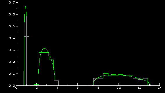
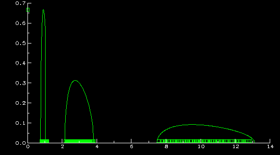
I'll try to explain what the above graphs represent. The histogram in
the first one is that of the eigenvalues of a sample covariance matrix
(s.c.m.) formed from 4000 samples of a 200 dimensional random vector whose
population covariance matrix has 3 distinct eigenvalues:
1, 3, and 10, with respective multiplicities 40, 80, and 80. The
assumptions on the random vector are general enough to include multivariate
normals. The function you see in both graphs is the limiting density
(whose existence and properties are part of my work) of the empirical
distribution of the eigenvalues of s.c.m. as the dimension
and sample size approach infinity, the population eigenvalues remain at
(1,3,10) with relative proportions (.2,.4,.4), and the ratio of dimension
to sample size is .05. The closeness of the limiting density to the
histogram displays several things: 1) the validity of the above mentioned
``limit theorem'', 2) the ``curse of high dimensionality'', namely that, even
though 4000 samples were used to estimate the population matrix, because
of the dimension of the random vector, the estimation is not so great, and
3) since the histogram of eigenvalues is predictable from the limit
theorem and because of an understanding of how the limiting
density should look, due to the relatively small ratio of dimension
to sample size (.05), the histogram does reveal quite a bit of information
on the eigenvalues of the population matrix (after all, there are 3 clumps
centering around the population eigenvalues).
The second graph also contains a scatter plot of all 200 eigenvalues,
in clumps of (from left to right) 40, 80, and 80, demonstrating
Z.D. Bai and my previous results (see references 32 and 33 in publications): no
eigenvalues where they shouldn't be, and the
right number where they should be. These two facts,
although thoroughly reasonable from the above limit theorem, are a bit
more complicated to prove. The limit theorem only guarantees proportion
of eigenvalues are converging to the right numbers.


![]()


 .pdf file
 .pdf file
 .pdf file
 .pdf file
 .pdf file
 .pdf file
 .pdf file
 .pdf file
 .pdf file
 .pdf file
![]()
 .pdf file
![]()
![]()
 Publications
 MA 544: Computer Experiments in Mathematical Probability


![]()
![]()